REVIVIFY Designers
/
 The Chefs at PromoKitchen and SanMar/District thank the designers below for their time and talent!
Now that the artwork has been completed, I asked designers the following question: Can you tell us how you feel you were able to capture the REVIVIFY spirit/theme in the work that you created?
The designer's answers will be posted with their artwork as they come in below with their submission. The winner will be announced on Dec. 6th, so make sure that you show them your support for a job well done with comments and your "likes" via Facebook or here!
You can still check out the original contest rules here: http://promokitchen.com/revivify.
Stay tuned!
1.

 Michael J. Duhamel
Graphic Artist
Accolade Promotion Group (APG)
Michael J. Duhamel
Graphic Artist
Accolade Promotion Group (APG)
Our world is constantly evolving and it's 'out with the old and in with the new.' But as we may not agree with all that change, it is a crucial part of life and with that we hope that change is always in our favour. My concept of the word REVIVIFY as a monument or building structure being constructed back to life, is a concept a lot of us can relate to. Living in the city there is construction everywhere and although it is a hassle and a major inconvenience, we are always better for it in the end.
Construction is necessary to improve upon the foundation. Revivify the structure will in the end revivify the means.

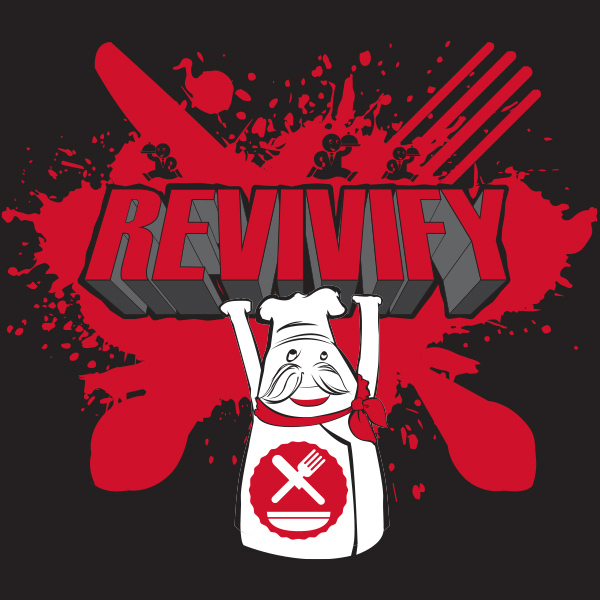
2.
 Mark Valleskey
Multimedia Specialist
Bag Makers, Inc.
Mark Valleskey
Multimedia Specialist
Bag Makers, Inc.
Right off the bat I was stuck on the kitchen theme, and a chef. There was no getting around it.
Revivifying this chef empowers his physical strength, focuses his mind on culinary skill, and brings back that deep passion that can be lost after working the same job for years. This extra effort creates better food, happier customers, and an excited waitstaff. Customers recognize this and return for more. Though they could get food anywhere, why bother?
Good food and service gets you to come back to a restaurant, are promotional products really that different? That’s food for thought.
3.

 Brooke Laliberte
Graphic Designer
Sunrise Identity
Brooke Laliberte
Graphic Designer
Sunrise Identity
My design symbolizes “movement” which I think is the perfect way to describe the theme & style of REVIVY. Growing is an act of movement and REVIVY means “to give new life to” which is a form of evolving, changing & growing. Our industry is always moving and evolving in new ways and it’s the clients, suppliers, sales people and the work of designers in the industry that are controlling this movement, similar to the way a puppeteer controls the movement of a puppet. The artwork becomes the puppet to how we as an industry move.
4.

 Ashley Barber
Assistant Art Director
T-Formation
Ashley Barber
Assistant Art Director
T-Formation
Revivify: To give new life or vigor to. Such a deceptively simple concept, yet filled with enough subtlety that boiling it down into a bold and iconic visual statement was difficult. What would it take to revivify an industry, let alone one as vast and varied as marketing and promotions? Immediately I began to think about networking, making connections, and planting seeds that would later grow into strong, steady trees. This is why I chose the symbolism of an acorn. An acorn, like the definition of revivify, is at first glance deceptively small and simple, yet hidden inside is the potential to grow something truly great. It’s only by planting the seeds of personal connection that all other growth can be facilitated, and thus the whole revivified.
5.

 George Helton
Customer Service Representative
Print Resources, Inc
George Helton
Customer Service Representative
Print Resources, Inc
6.
 Marc Kozak
President
Blue Monster Promotions
Marc Kozak
President
Blue Monster Promotions
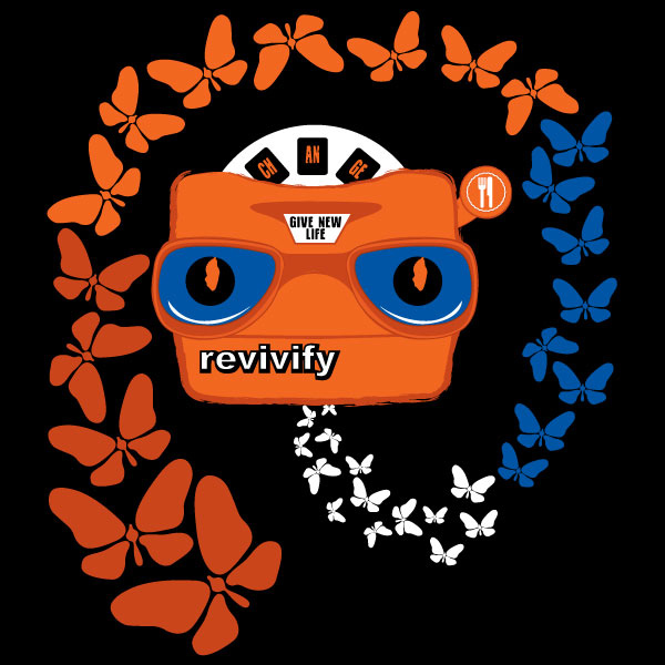
Change has evolved from the earliest days of this planet and continues on now and through out the future. Adapting to change is sometimes rough and challenging. This is why I chose the title of my design "Circle of Life". From a caterpillar nesting in a cocoon then evolving into a beautiful vibrant colorful butterfly, to a promotional product like a pen that evolves to a stylus for the use of modern technology. Its is not an easy process to give new life. There is a lot of blood, sweat and tears that go through this process. Only a few will adapt fully. The viewmaster is a great example of this theory. It was one of the coolest and hip toys to own when I was a child. But as time changes and new toys come around, The Viewfinder takes that seat on the shelf of lonely toys. It took some time, nesting in a cocoon, but the viewfinder has come back to life as a tool to help me self promote my business and my clients. It tells a story about change and being reborn. It's a great big beautiful tomorrow. I want you to look deep in the viewfinder and flip through the evolution of progress. Promo Kitchen has made this possible in the advertising specialities industry. As a creative artist, I need to be thinking of whats next and how to be one step ahead of my competition. if you don't adapt, you will fail. Promo Kitchen is there for you not to fail but to take on change like the butterfly, ready to take on the world.
7.

 Paul Mann
Creative Director
C&S Sales
Paul Mann
Creative Director
C&S Sales
In designing the Tshirt for REVIVIFY, I wanted to keep it simple, but also represent the idea of reinvigorating thought, abstractly. Evolving and exploding from a brand perspective, the design is symmetrical and clean with a central theme. Bottom line, I wanted to create something that I would wear…a design that is thought provoking and would invite a person looking at the design to ask "What does REVIVIFY mean? And what exactly are you attempting to REVIVIFY?" Hopefully, it works…we shall see.
8.

 Kevin Arnold
Art Director
Bloomin Promotions
Kevin Arnold
Art Director
Bloomin Promotions
I felt like the REVIVIFY theme for a T-shirt contest was a perfect opportunity for artists, like myself; to express our creativity through the expression of new growth and development. As the Art Director for Bloomin Promotions, a company that makes handmade seed paper (plantable paper embedded with seeds), the REVIVIFY theme was a fantastic match. As soon as I heard the theme, the thought of showing growth through sprouting leaves blooming from the word, popped right into my mind.
9.
 Brian Stottlemyer
Account Executive
Vernon Graphics & Promotions
Brian Stottlemyer
Account Executive
Vernon Graphics & Promotions
When trying to come up with a t-shirt design to express the word Revivify, I was challenged to come up with just one idea. So, I thought, what takes place before something or someone can be revitalized? Before one can impart new life, energy, or spirit, one must first make a change. But how do I approach change? I realized that you must make a choice and change direction from the way you are headed. That is why I choose the Chevron pattern which is used in traffic signs for warning to change direction ahead and I wanted a abstract design that is simple and uncomplicated.
10.

 Jes Onions
Social Media Coordinator
Pro Towels
Jes Onions
Social Media Coordinator
Pro Towels
The promotional products industry isn't dead but it is evolving, especially in the past few years with the use of Social Media. Since Revivify means "give new life or vigor to" I thought a zombie theme was the perfect way to go. Promo Kitchen is a great new community for the promo industry that aims to "create a new voice for the industry". In a sense it's reanimating the promo industry and giving it a new life, that's why the zombie hand is holding the PK knife and fork.
11.

 Anthony Romano
Marketing Coordinator
Pro Towels
Anthony Romano
Marketing Coordinator
Pro Towels
After a lot of sketches and talking ideas thru with other designers, I wanted to create something that showed how the industry has gotten to almost a cookie cutter state. Projects become almost plug and play. That's where the robots came into play. Promo Kitchen was created to break outside the box and is represented by the human character in the design. I wanted to choose a simple two color design to add the most impact.
And help convey my idea of thinking outside the box. I feel that I was able to express the REVIVIFY theme by allowing individuality to take center stage. Showcasing the impact that PromoKitchen will have on the industry in the upcoming year and bringing attention to making the industry personal again.
12.
 Burt Wood
Contract Art Producton
Pro Towels/Superior Decorating
Burt Wood
Contract Art Producton
Pro Towels/Superior Decorating
To me, Revivify means taking an existing concept and cutting it up to create something new. The sum of the parts, when combined in a fresh way, brings forth new life.
13.
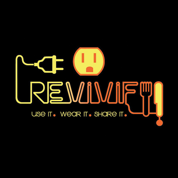
I have always felt typography can be equally as strong as other design elements due to simple, yet dynamic characteristics of a letter. I like to look at what something can become while utilizing its own features. Hence the placement of the PromoKitchen logo in my design. The font I chose implied "electricity". I wanted to define the meaning of REVIVIFY and vigor to by expressing energy and rejuvenation. Our industry requires drive and all of these aspects to succeed. Use It, Wear It, Share It….get PLUGGED IN 2014! Tonia Cochran
Director of Creative Art Services
Pro Towels
Tonia Cochran
Director of Creative Art Services
Pro Towels
14.
 Brantley Wood
Art Producton
Pro Towels
Brantley Wood
Art Producton
Pro Towels
Trying to explain Revivify was challenging. Revivify means to bring new life to, so for that to happen you needed the right ingredients to be successful. That led to my design, The Mad Scientist in the lab adding all the right ingredients to Revivify the Promo kitchen. IT'S ALIVE… IT'S ALIVE!
15.

 Liam Munroe
Art Director
HPI Direct
Liam Munroe
Art Director
HPI Direct
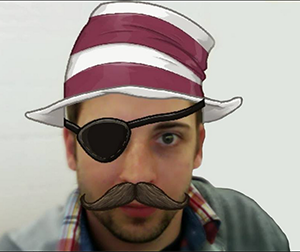
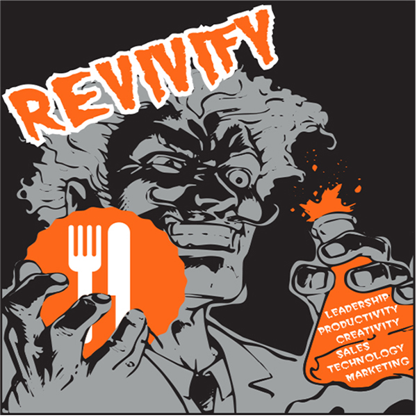
The definition for REVIVIFY immediately brought to mind the claims and promises of vintage medical ads and current energy drinks. The idea of an All-In-One revitalizing wonder cure seemed to not only fit the challenge but would be the perfect thing to have on hand after spending time in Las Vegas. The vintage style allowed me to create an eye-catching layout/illustration while playing with the typography and “claims” that will ignite new excitement for the Promo Kitchen party and the promo industry.
16.

 Scott Ballentine
Art Production
Pro Towels
Scott Ballentine
Art Production
Pro Towels
The word revivify made me think of the old traveling medicine shows and their miracle tonics. So I based my design on the tonic bottle and the promises of renewed vigor and energy.
17.

 Jonathan Keller
Creative Director
LocoBranding
Jonathan Keller
Creative Director
LocoBranding
When I think of the word Revivify I think of creating something amazing. And what better way to do that than through food. You begin with the basic ingredients, starting from scratch and combining bright flavors to make something unique. Like baking, sometimes it can get a little messy along with way and it takes time and heart, but the finished product is something everyone can enjoy.
18.

 Crystal Malek
Graphic Designer
Creative Promotions
Crystal Malek
Graphic Designer
Creative Promotions
I love ideas that are simple, clean and effective in conveying a message. Revivifying, to me, is a lot like renewing or reinventing. I felt like the circular arrow would show a rebirth, of sorts. Didn't want anything too flashy or busy, hence the minimalist approach. When working on a shirt, I like to design one that I'd actually wear more often than only during an event. That's the sort of shirt I'd wear.
19.
 Beau Warren
Head Farmer
Idea Farm
Beau Warren
Head Farmer
Idea Farm
To me, Revivify is all about the products, the variety, the choices we make on what we put our client's brand on. "BRAND new world" to me represents the decision to be my own boss five months ago, but it also represents this exciting time in promotional and marketing products as a whole! Thanks so much for the opportunity!
20.

 Corey Geer
Senior Graphic Designer
T-Formation
Corey Geer
Senior Graphic Designer
T-Formation
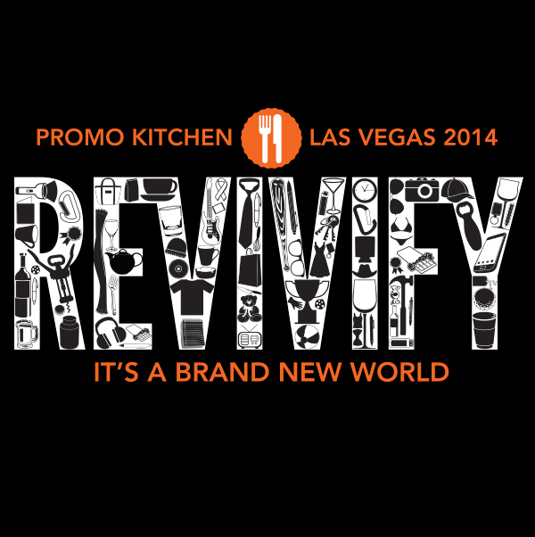
I used lightning bolts to symbolize the energy of revivification. I made the word Revivify the largest element in the design so that it is immediately the center of attention. Arching it over the crossed fork and knife of the Promo Kitchen design elements gives the design movement as well as a focal point. The tag line, Igniting a new Attitude, was taken from the Promo Kitchen website and incorporated into the layout to reinforce the meaning of Revivify. The subdued background type uses repeated words which are synonymous with revivify and creates a framework which locks the design together. The lightning leads down to the PK logo. The starting point of this Revivify movement.
21.
 Adair Sasso
Designer
T-Formation
Adair Sasso
Designer
T-Formation
22.

 Jason Curran
Graphic Designer & Photographer
HPI Direct
Jason Curran
Graphic Designer & Photographer
HPI Direct
I think from time to time we get burnt out. Dealing with tight deadlines, guidelines and other restrictions sometimes makes it difficult to stretch our creative muscles. Getting stuck in the day to day routines can leave you feeling like a machine. Eventually you need a jolt, something to recharge your creativity. Getting the opportunity to work on a custom design was just the zap I needed to REVIVIFY my creativity. Every new year is a chance to REVIVIFY yourself. Fresh batteries to get you through the challenges ahead.
23.

 Vince Labolito
Art Director
T-Formation
Vince Labolito
Art Director
T-Formation
My thought process with the design was to start out with the text for the word "REVIVIFY" in bad shape, decayed and corroded. Pieces of the text were missing, and chunks were broken off to suggest erosion over time. As the word progresses up the shirt, (the vertical layout was intentional to suggest growth and reaching for the sun) the text gradually gets cleaner and cleaner until the last two letters (FY) are completely clean with no erosion. This is to show that we've left behind the disarray and started fresh and clean. The leaves on the "Y" are to suggest that now that everything has been put back into place and cleaned up, that finally new growth can begin. The future is wide open and there's nothing to stop us. The tagline "GIVE NEW LIFE" was taken from the literal definition of "REVIVIFY." The color scheme was chosen to emphasize each word in the phrase with the word "LIFE" printing in green as the color is suggestive of life, just like the leaves on the trees in Spring.
24.

 Christina Phillips
Production Artist
T-Formation
Christina Phillips
Production Artist
T-Formation
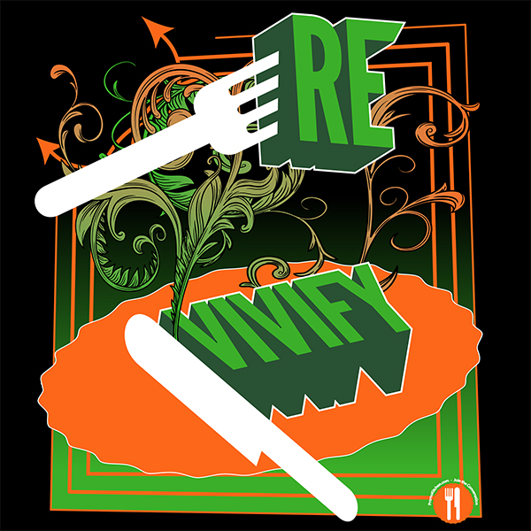
I believe that new life starts with something simple and bold. You start a new life with a bold move. You start a new song with a bold note. And, in my case, I started this new design with a bold fork. I used the KitchenPromo utensil set and buzz words representing REVIVIFY to create a design that is geometric and simple, yet represents the theme and brand as much as possible. I mixed typography with graphics to create a bold visual look that will be eye catching and portray to the viewer what REVIVIFY encompasses.
25.

 David Gephart
CEO
Gephart Marketing Solutions
David Gephart
CEO
Gephart Marketing Solutions
With “REVIVIFY” meaning: give new life or vigor to - I wanted to show how the industry that we love (heart) is rebounding since 2008 or as I show – Rising like a Phoenix (bird), from the ashes!! J
Keeping it simple- I used Red, White, and Blue colors. And of course, we ALL LOVE “Promo Kitchen”!!!!